With an internal reorganisation and rebuild imminent at Flakefleet Primary School in Lancashire, Headteacher Mike Barnes decided to take the opportunity to remove most of the pinboards and paint the walls brilliant white. Whilst this sounds counterintuitive, the rationale was simple: pinboards had to be filled to avoid looking ugly and this was a use of time better employed elsewhere.
Teachers and support assistants spent hour upon hour ensuring displays in their classrooms were filled (especially before a parents’ evening or OFSTED inspection!) and displays often subsequently sat untouched gathering dust until, gradually, they had become so tatty as to demand staff go through the whole exercise again. And having to fill the boards almost undermined the celebration of the work being put up – was it there because you had a space to fill rather than it being something truly special? Mike suspected that might well be the case.
Having plain white walls, on the other hand, meant that students work could still be celebrated but only when appropriate: clip frames meant you simply slid what you wanted to celebrate under the clips or behind the glass. It made it incredibly special too – Mike even added small hinged-door boxes on corridor walls in which to secrete extra-special pieces of work to be discovered by students as they walked past. And on top of that, the projectors that came out of classrooms as they were replaced with interactive ones, were repurposed – projecting work (as well as inspirational quotes and information for students) directly onto the white walls, and as this could be changed in an instant, it made it meaningful to staff and students alike.
But if you think that bright white walls will end up looking tatty within 5 minutes of children brushing past them, think again. “By keeping to a matt rather than silk finish” suggests Mike, “means you can simply paint over any marks you can’t wipe off, keeping it all looking clean and tidy”. But if you want to avoid even this, Johnstones Brilliant White Endura super-durable paint has been tested to Class 1 ISO 11998 – scrubbed 10,000 times and only, according to independent paint retailers, Brewers, matched in the UK by Crown’s Trade Clean Extreme. The result of extensive research into paint technology, Endura is, Johnstones claims, the hardest wearing paint on the UK market, developed to provide high traffic environments such as shopping centres and leisure facilities as well, of course, as educational spaces with paint finishes that stay looking good for longer (it’s available in 7,000 colours if you remain unconvinced by white!)
Looking at the Victorian school buildings that are West Thornton Primary Academy in South London (see next issue for full case study) on the other hand, and you would be forgiven for thinking that white has no part to play in the colourful interior. But, within the vibrant learning spaces formed out of the traditional old architecture, it’s used as a backdrop, enabling the colours they did use to become features; to really “pop” as headteacher Di Pumphry explained. “People make assumptions” she said “about what young people want” before lamenting the typical royal blues, pillar-box reds and emerald greens of many primary settings. “But we couldn’t have done it without Google” she continued, revealing that her Pinterest board has hundreds of images gleaned from the internet. Because the strong aesthetic she and her team created at West Thornton started with the premise “what can it look like?” taking in research that included retail and office spaces as well as learning ones. “Influences come from everywhere” she said, “including a Weymouth pub visited en-route to IPACA”. But she had to be pragmatic too, accepting that if, for example, a chair she wanted was only available in a particular blue, she may have to tweak the colour pallet accordingly. Incorporating patterned wallcoverings as well, she has created a cohesive scheme, rich in texture and depth and easily mistaken for the work of a professional interior designer.
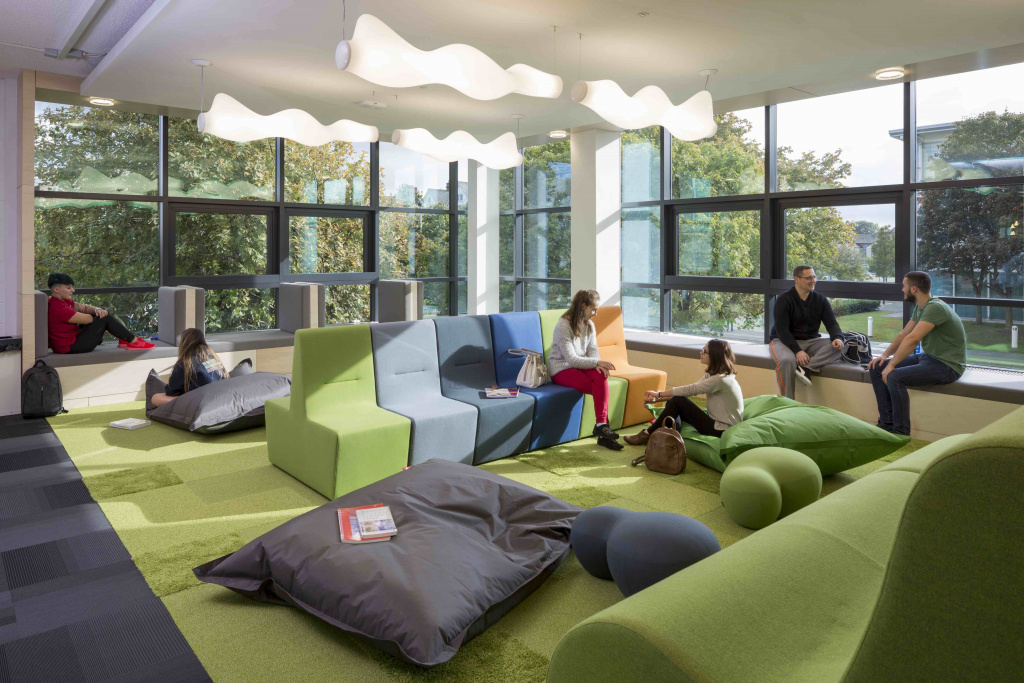
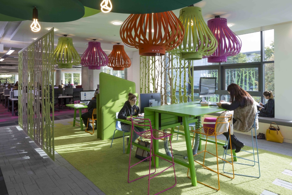
Which is the direction Teesside University took, commissioning CPMG Architects to remodel their library in a £6m transformational programme of investment to support student learning. “Whilst the floors were open plan, navigation could be difficult” commented Hugh Avison, Design Director at CPMG. The answer lay in giving floors unique identities and purposes. “We needed to zone the building” Hugh continued, explaining that the higher up the building you go the quieter it becomes with a vibrant café and social spaces on the ground floor and silent study spaces on the top. Each floor was then given a base colour: green, pink, blue, turquoise and orange which is subtly applied within the core atrium space in order to depict the levels and relate to the activities on each floor. And these colours are then drawn into the spaces themselves, expressed on furniture as well as floorcoverings and the walls, creating a legibility about the building. A small uplift (of around 20%) in some of the floor finishes was, Hugh felt, particularly successful showing it isn’t always necessary for design and colour to translate into cost.